Monday, December 12, 2011
Rusty!
You already have one of my Portfolio pieces, The Society of Illustrators. Its the Giant Heart.
Final Portfolio
So, Here goes a nice big 65% of my Grade. In no particular order...
 #1 Society of Illustrators.
I feel that this is my best piece from Illustration. It was the first Digital Painting where everything really clicked, and I really got a hang of working with the Tablet. I really enjoyed having a completely open concept on which to work on. I also got a lot of feedback on Rusty on this, which probably helped a lot. I felt the organic and mechanical elements looked pretty nice side by side, and the different ways I showed them meshing the middle. If I had time to change things, I would have fixed the upper left tube and fixed up some detail on the metal components. Otherwise I was very happy how this turned out. I also really liked the white background for some reason, really helped bring the heart to life.
 #2 Life and Death
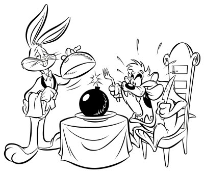
I really like the Life and Death project, In particular I liked my Life concept from the first Comp. I designed the simple cartoon bomb based off classical cartoons such as Loony tunes and also the Bo-ombs from The Mario games. I was happy how the final illustration turned out, and What I managed to convey using very little color. I thought the Skull and crossbones mark stood out well on the bomb, as well as the spark of fire on the fuse. The Smoke on the Death illustration also looks good, Unfortunately I was never able to fully resolve the blast marks on the ground to a point I was happy with.


#4 Book Cover
For my Book cover, I chose to Do George Orwells 1984, a Dystopian vision of the future. The concept behind this was graffiti like type blending together, containing terminology from the book. Above this all is the Harsh bright red word 'Obey', Because one does not defy Big Brother. I liked the simple concept behind this illustration, and it was interesting to do something with only type. I originally planned to do this on Art board with some inks, but time constraints and my judging eye deciding I didn't have enough Ink meant it was Digital. Like everything else in this portfolio. I was mostly happy with how this turned out, The layered effect of Obey was something I hadn't planned on, but seems to work well. The only problem I have with it is the background, which is just too strong/solid of a color. If I had managed to create a much lighter paper texture I would be more happy.

I feel that this is my best piece from Illustration. It was the first Digital Painting where everything really clicked, and I really got a hang of working with the Tablet. I really enjoyed having a completely open concept on which to work on. I also got a lot of feedback on Rusty on this, which probably helped a lot. I felt the organic and mechanical elements looked pretty nice side by side, and the different ways I showed them meshing the middle. If I had time to change things, I would have fixed the upper left tube and fixed up some detail on the metal components. Otherwise I was very happy how this turned out. I also really liked the white background for some reason, really helped bring the heart to life.

I really like the Life and Death project, In particular I liked my Life concept from the first Comp. I designed the simple cartoon bomb based off classical cartoons such as Loony tunes and also the Bo-ombs from The Mario games. I was happy how the final illustration turned out, and What I managed to convey using very little color. I thought the Skull and crossbones mark stood out well on the bomb, as well as the spark of fire on the fuse. The Smoke on the Death illustration also looks good, Unfortunately I was never able to fully resolve the blast marks on the ground to a point I was happy with.

#3 Classical Composer Album
I chose the Classical composer project as I thought it could be some of my better work, as when I first handed it in it left a lot to be desired. So I spent some time fixing up weak spots such as the pen and pocket watch and fixed some of the coloring. All together I think it comes together well. I kind of which the claws holding the pen looked a bit better... I had a lot of trouble getting those right. I liked working with the colors in this illustration. The blue and grays of the Magpie looked really nice, and the red and oranges of the background were really vivid. I thought the Type went well with the image, and retains its readability at smaller sizes.

For my Book cover, I chose to Do George Orwells 1984, a Dystopian vision of the future. The concept behind this was graffiti like type blending together, containing terminology from the book. Above this all is the Harsh bright red word 'Obey', Because one does not defy Big Brother. I liked the simple concept behind this illustration, and it was interesting to do something with only type. I originally planned to do this on Art board with some inks, but time constraints and my judging eye deciding I didn't have enough Ink meant it was Digital. Like everything else in this portfolio. I was mostly happy with how this turned out, The layered effect of Obey was something I hadn't planned on, but seems to work well. The only problem I have with it is the background, which is just too strong/solid of a color. If I had managed to create a much lighter paper texture I would be more happy.
Tuesday, December 6, 2011
THIS.

Yeah, completed World record Illustration, two days after it was due. This actually looks a LOT better than I thought it would. I kind think the sprays of fizz could have used some work, as well as the mentos packets.
Monday, December 5, 2011
Illustration is cool
This is awesome and you should gaze upon it with those two jelly globes you call eyes IMMEDIATELY.
http://anexquisitebeast.com/
This is pretty cool, each illustration works in the next one, and it seems to be updated daily.
Also, this
http://www.agoodson.com/
http://anexquisitebeast.com/
This is pretty cool, each illustration works in the next one, and it seems to be updated daily.
Also, this
http://www.agoodson.com/
The glory of the copy/paste function

Managed to avert the crisis and get something done. Kinda different from my comp, but still sticking to the same idea. Just need to fix up some of the coloring on the brown fizz, and show the mentos more. Im thinking of adding in a packet of two flying up into the air in the background.
Sunday, December 4, 2011
Well...Crap.


ON the other hand, the black background looks cool. I better not have to do this in Photoshop :(
Wednesday, November 30, 2011
Thoughtcrime does not entail death, thoughtcrime IS death


Sooo, I was actually really excited about coming up with an awesome book cover, cause frankly I love 1984 by George Orwell. If you haven't read it, I would highly recommend it. On the first one I went for a combination of graffiti style type consisting of terms from the book. They culminate into the the Giant 'Obey' written in a shocking colour reminiscent of blood. I think the Thick type for the title really helped with bringing it all together. I'm going to be creating the actual illustration using a calligraphy pen and some India ink. I'm going to use some Ochre watercolor to get a nice yellow effect on the paper for the background.
For the second comp, I went with a more typewriter/stamp effect, but still using terms from the book. Four letters are picked out to spell 'Obey', but this second attempt definitely didn't come together as well.
Feckin' Birds Again.

Heres the completed LP sized classical composer cover. I choose to do La gazza ladra (The Thieving Magpie) by Gioachino Rossini. Really, this isn't even finished, at least not properly. Its still got lots of little details that need fixed (The calligraphy pen, Pocket watch, feathers) And some touching up in places. Going to be including this in my final portfolio, but it needs quite a lot of work.
From what I've got here, I was kinda happy with the background, and in general the majority of the Magpie.
Monday, November 14, 2011
Magpies like shiny things.


Okay, So this is my Comp for the classical album cover, which took a while to get approved. At first, I was too sure about some elements (Background, coloring, some minor details) so, didn't get an okay from the author of the blog we all love and worship. So, Went back and fixed up some stuff, figured out a dramatic background (He's flying off into/away from the sunset with his stolen loot) And got an okay ^__^
I think without the bandanna, The magpie looks a lot better.... But damn did I like that thing. If I had a pet bird, it would definitively have a bandanna.... and possibly cape.
Shut up and listen. You might learn something....

So, this isn't EXACTLY the version I handed in, but I dont know where its gotten too.... So you get this. The only differences are some minor tweaks to the Text and the MAC logo was actually correct.
I completed this project on a very tight schedule, that being I started and completed it on the day before hand in.
BOSS.
Anyhow, I struggled a lot dealing with only 2 spot colors, especially in Photoshop with its weird, weird channels. Even though the face was originally planned to be in color, I like the way it turned out, Rusty did as well.
But the Text.... I always make the damned text too big!! a;fha;hdfs;kfhj;asfh >:(
Anyway, I'm happy with how this turned out. Not my best hand in, but definitively not my worst.
Sunday, November 13, 2011
Monday, November 7, 2011
New Heart for Transplant

Completed Society of Illustrators Illustration. I was actually really happy with how this turned out. I got a lot of feedback from Rusty, which helped with some of the issues that arose. I spent a lot of time merging the organic and metal halves of the heart. Probably one of my favorite parts was how I could stretch the skin over the metal part, but also include the metal tentacles that burrowed into the heart, seen beneath the...Membrane? 0_0 Not sure of the word.
Also, The final print out was really nice, Not having to color balance the illustration really pays off. The glossy paper made the colors really pop as well.
Wednesday, November 2, 2011
SOI WIP

So, my weird Half Heart/cyborg Sci-Fi creation is coming along well. I need to add some details and clean up some of the lines. Rusty also pointed out that some kind of off set shadow on the bottom or possibly the side could help. I also think that the living side could use some more lighting in certain spots.
Overall, its coming along pretty well.
Friday, October 28, 2011
Rather die on my Feet than live on my Knees


Life and Death assignment. I was pretty happy with how this turned out. The comp that I got approval on was one that was easy to accomplish, with the majority of my color relying on black and white tones. The bomb idea was taken from cartoons and possibly the bo-omb from the maris games (http://www.mariowiki.com/bob-omb)
Also, from the loony tunes (http://www.google.com/search?q=Acme+Bombs&hl=en&client=safari&rls=en&biw=1024&bih=867&prmd=imvns&source=lnms&tbm=isch&ei=Mq-qTuDBAcijsQLBu7jjDg&sa=X&oi=mode_link&ct=mode&cd=2&ved=0CAsQ_AUoAQ)
I felt that the Death part could have been resolved better. I mean, I tried, but everything looked worse than what I already had. I feel that the smoke trail looked pretty good though, very subtle.
Tuesday, October 25, 2011
I'm Half a Cyborg at Heart

Looking at the completed Comp, it feels like more is going on with the metal side, More detail/activity. This is something to be corrected with the actual illustration. That big ugly line is the middle will also be removed. I thought I already did take it out, but apparently not... And I'm too tired to do it now.
Rusty will give me some good advice tomoz, Hopefully.
Thursday, October 20, 2011
Dry Ace

Completed No. 5 Illustration. I felt like this didnt take as long to complete as other projects Ive done in illustration. This is probably because I did it digitally, Which meant it was really easy to edit and revise things and also I didnt have to scan it in or prepare it to print :)
I liked the theme of Five aces I went with in the piece. I think the thickish outline on the hand and cards really help to bring it into the foreground. The Chips in the background were NOT fun to do.
On a somewhat related note, The S key is beginning to die on my laptop. This isnt good.
Wednesday, October 19, 2011
Midterm Portfolio

I chose this illustration because I thought it was one of the best from the many we did. All three of my line art choices are the three I redid on Illustration Board. So anyway, This was an observational piece of my headphones. I tried to use Directional line to give a sense of proportion and definition. I thought the lettering and the Form parts of the drawing came out best.

2nd Traditional Line Art
This was a broken line style picture of a person walking away. FYI, I have no clue who this dude is. Anyway, I tried to go for something different with this piece, mainly because drawing people is not my strong point. I thought it gave an interesting effect, and helped to show where some light fell. Probably could have done with some heavier line quality on some points, but otherwise its one of my strongest line arts.

3rd Traditional Line Art
This is my strongest line art piece. You wouldn't believe how soul destroying it was to do all the little symbols. So yeah, this is a observational nature piece, where I imaged the surface of the tree using symbolic lines. The heavy outer line really helped to define the tree from the background.I considered adding more to the background past the horizon line, but I felt that anything more would have taken away from the tree.

1st Watercolor
This is the 20x30 watercolor we did, The first one. This is the definitely the best watercolor Ive done to date. I chose a landscape that interested me and limited myself to yellows, golds and browns to accomplish the piece. I really think the heavier gold shadowing around the horizon line helped define the difference between the sky and the reflections in the water. I struggled with the stones underneath the water for quite a while, but I think after messing around with them a lot I eventually go them kinda right.

This was done in our first class session with watercolors, Seems like forever ago. I took my time, and got it done right. I deliberately left the background pale and very undefined to keep the foreground tree as the focus. I thought I captured the Color and density of the leaves quite well, using a sponge for the effect. The only annoying thing is that I can see the Branches through the leaves. Learn and let live I guess.

1st Traditional Color and Line
This is a butterfly on some leaves with a fairly washy background. Of this portfolio, my color and line is probably the worst. Looking through what I had, I couldn't find any really good ones. Anyhow, I liked the colors I used I used for the patches on the butterfly wings and the line effect I got from the pen.

2nd Traditional Color and Line
This is a Mountain which is reflecting itself in the water. I used a few washes and added some small shadow detail on the sides of the mountain to give it some form. The line art was used to give it some definition. I really simplified the illustration down to make it work with the wash.

3rd Traditional Color and Line
So yeah, This is a random book....Even says it on the cover! I was just messing around with washes and what I could do when line a was added. I felt this was a good piece, as the wash contrasted well with the book, and the line helped to give it grounding, definition and form.

Gouache Illustration
I chose the Lincoln illustration I did mainly cause the other Gouache painting Ive done is the the three image montage and it SUCKED. I used a Gesso spray before painting onto the watercolor paper and it really helped with blending in this piece. My favourite part of this one are the Blood and its reflection and also the floor boards (surprisingly enough) This took several hours, but thankfully I chose a simple illustration and had a good composition.

Digital line Art
SO. You may notice, but this looks familiar to my watercolor landscape. I really liked the image, so It was my first choice for trying out the Wacom tablet. I really liked the effect I could get by getting in close with the zoom and laying down some directional line. That combined with how the stones underneath the water turned is why I chose this illustration.

Digtal Line art with Color
This is for my Number 5 project. Its still in need of some correction before hand in time, but I think its far enough along to warrant a spot in my portfolio. I particularly thought the hand and cards were coming along well. Being able to blend colors in Sai is really handy, and can be used to get come good effects. The designs on the cards are actually easier to make than I thought they would be.

Artist Choice
Couldn't help but include this little bomb, one of my comps for the life and death project, It was done in Sai with the wacom tablet. I chose to do something resembling cartoon bombs found in the likes of loony tunes for example. Therefore when I went into Sai to do this I knew exactly what I was doing, and put this out a lot quicker than my other comp. I thought the shadow of the bomb and the lighting really brought it to life. I also loved the little Skull Face.
Monday, October 17, 2011


These are the three Life and Death comps that were due to be judged by Rusty on Monday the 17th. I didn't really find it hard to come up with three ideas for this, As it was a fairly loose problem to solve. Out of the ideas the bomb was definitely my favourite, and also coincidentally came out the best when I illustrated it. Rusty also gave his Stamp of approval on the bomb which is good.
The cocoon idea was cool I thought, but it didn't get illustrated well. The melting wax candle would have been interesting to paint, as I'm sure I could have created some interesting visuals in Sai, But I'm in love with the Bomb. I based it off the cartoon style 'Looney tunes' bombs (http://gestaltist.com/wp-content/uploads/2011/05/Bugs_taz_bomb.jpg) same with the comical explosion marks.
Smokin' Aces update

This is the progress Ive made so far on my number 5 illustration which is due in on Monday. Rusty gave me some good advice on what to change and touch up, but otherwise I think its looking good. Once I get some more definition on the Hand and fix some of the perspective issues with the poker chips we will almost be done.
Alan managed to ask me if the hand holding the cards was African-American because the he was gambling. What racism!
Smokin' Aces


Here are two comps for the 5 illustration. The idea is having five aces in as your hand in poker, So you can't lose. Rusty liked the idea, Gave it a stamp of approval, But said to change the had with the cards over to the left and add some more piles of chips, to emphasize the winning steak with the hand.
I like the idea, and I'm enjoying illustrating it in Sai with the Wacom tablet.
He looks this weird in real pictures.

So... Its been a month or two since I've been here (seems a long time) And I've already forgotten what one of my best friends back home looks like.
NOT GOOD.
For being a memory portrait this didn't turn out too horrible. I mean, the eyes are kinda off (That seems to be something I regularly struggle with) But apart from that Its alright. I used a water color wash and line art for this, which seems to have gone done out. his hair and shirt could have used some more definition as well as some more realistic looking eyes.
Pretty flowers


These were two water color illustrations done in Class under rusty's watchful eye. I liked the first one I did, I think though it could do with some heavier red lines for definition. I thought the deep green background helped bring out the foreground a little more. As for the second version I did....Well It looks like its decaying or something. I thought the gold and blue would go well together, but apparently they didn't.
It's spelled 'Colour'... Just saying.


Again, these were done with the wacom tablet and colored in Photoshop CS5. I found it cool and frustrating adding color in Photoshop. It was really hard to get some colors to believably blend together. Ive since started using Paint Tool Sai which I enjoy a lot more. I really just tried some different approaches with each piece, trying to see what I could accomplish with each. I also went for a very different color scheme with each.
I personally liked the Eye the most. I left the rest of it uncolored as I liked how much it made the iris stand out. Rusty commented that I must be 'getting the hang of it' when he seen the flower.
That means he likes it.
Wacom Goodness


I really enjoyed working with the Wacom tablet to do these digital illustrations. It was nice to be able to zoom in to work on pesky bits, and to take a few steps back when somethings gone wrong. I actually liked all of these except the bottom one... It went kinda crapish. The trees fairly messy, But I was really just experimenting with what I could do. I really like the Landscape rocky spires, I think the crossed line shading worked well on it. Also the sharp details and being able to finally get those damned stones under the water correct!
I also liked the Coke can, But I think the beads of condensation on its surface really didn't come across too well... Looks kinda like it has warts.
Subscribe to:
Posts (Atom)